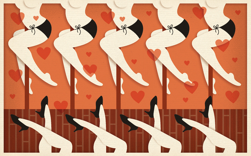
This lettering piece may not look much different to you than some of the other pieces I've posted here, but the difference is that I was able to take my time and not rush to get it all finished in one day as I have in the past! I am now creating one lettering piece per week rather than one per day. My goals are to have a little more time to myself in the evenings, to create lettering using some different techniques which I'll now have time to begin to learn, to create pieces with more visual interest and dimension and also, when I can figure this one out, with a more organic feel... more soul.
Another thing I may do at times is revisit a piece that I created for my daily HGT phrase project and edit/add/revise it to make it better than it was.
Admittedly, it was easier to have a daily goal and stick to it than to have a more lax goal of one per week and stick to that! I already took more than a week to get this first one posted.
I also want to write a blog post each day, or nearly each day, about some other wonderful piece of work by someone else. I've already done so with the last few blog posts, but I've yet to stick to a daily post. Wish me luck! And, I hope you enjoy today's lettering piece. :) I think the message is really really really really really important, by the way.
Saturday, February 27, 2016
Sunday, February 21, 2016
Ahhh.... Jessica Hische!
Yes, Jessica Hische is still my idol, my hero, one of my greatest inspirations when it comes to lettering, illustration, and design.
If you want to see some spectacular work, visit jessicahische.is. And by the way, her bio on her about page starts with the sentence, "Here’s a brief history of who I am, what I do, and why we should be friends." I love that warmth and welcoming opening statement. :)
One of the earliest projects of hers of which I'm aware is her "12 Days of Christmas" card set that she created in 2006. By the way, she had included these in her portfolio which led to her to working for the famous designer and letterer, Louise Fili when she (Jessica) was very young and just starting her career. She immediately relocated to NYC upon being offered this prestigious job. This was such a huge accomplishment for a young designer, and she proved herself to be so remarkably amazing in her work, she now has an extremely successful career of her own, working for such clients as Penguin Books, The New York Times, Tiffany & Co., OXFAM America, McSweeney’s, American Express, Target, Victoria’s Secret, Chronicle Books, Nike, and Samsung, to name a few!
Her description of the project, "12 Days of Christmas," from her website:
"This was a personal project that I sent out as a promo in the winter of 2006. It was a set of twelve postcards, each illustrating one of the twelve days of Christmas. They were all held together with a belly band stating "Happy Holidays" in hand-lettering."
I LOVE this project. Her illustration skills as well as her cleverness and sense of humor shine through so brightly. It's just lovely! So fun and beautiful! I love the way she illustrates animals, and I'm really drawn to the "cut-out-paper" look of this style. Everything is so well thought-out and crafted from the big picture down to the smallest details.
If you want to see some spectacular work, visit jessicahische.is. And by the way, her bio on her about page starts with the sentence, "Here’s a brief history of who I am, what I do, and why we should be friends." I love that warmth and welcoming opening statement. :)
One of the earliest projects of hers of which I'm aware is her "12 Days of Christmas" card set that she created in 2006. By the way, she had included these in her portfolio which led to her to working for the famous designer and letterer, Louise Fili when she (Jessica) was very young and just starting her career. She immediately relocated to NYC upon being offered this prestigious job. This was such a huge accomplishment for a young designer, and she proved herself to be so remarkably amazing in her work, she now has an extremely successful career of her own, working for such clients as Penguin Books, The New York Times, Tiffany & Co., OXFAM America, McSweeney’s, American Express, Target, Victoria’s Secret, Chronicle Books, Nike, and Samsung, to name a few!
Her description of the project, "12 Days of Christmas," from her website:
"This was a personal project that I sent out as a promo in the winter of 2006. It was a set of twelve postcards, each illustrating one of the twelve days of Christmas. They were all held together with a belly band stating "Happy Holidays" in hand-lettering."
I LOVE this project. Her illustration skills as well as her cleverness and sense of humor shine through so brightly. It's just lovely! So fun and beautiful! I love the way she illustrates animals, and I'm really drawn to the "cut-out-paper" look of this style. Everything is so well thought-out and crafted from the big picture down to the smallest details.
I'll be writing a lot more about Jessica and sharing her work. Stay tuned!
Wednesday, February 17, 2016
Erik Marinovich... Consider me wowed!
I'm looking for the holy grail of lettering.
Well, maybe there isn't just one!
Check out Erik Marinovich, an absolutely amazing letterer. And prolific! And extremely successful! I'm thoroughly impressed.
This is his client list:
Nike
Target
Google
Hilton
Sonos
Sharpie
Facebook
Criterion Collection
Ford Motor Company
New York Times
Mohawk Fine Papers
Wired Magazine
Nescafé
Mastercard
Chronicle Books
New York Magazine
Sephora
YBCA
Bloomberg Businessweek
Gap
Almanac Beer Co.
DwellStudio
TripIt
Lincoln Motor Company
Woman's Day Magazine
Converse
Maxim Magazine
Toronto Life
Seattle Met
Malibu Rum
Absolut Vodka
Newsweek
Metropolis Magazine
Graniph Tshirt Store
Dockers Air Canada
Holy cow!
And his bio paragraph:
Erik Marinovich is a San Francisco based lettering artist and designer, and is a co-founder of Friends of Type. Since 2009 he has drawn letters, logos and type for nice folks like: Nike, Target, Google, Hilton, Facebook, Sonos, Sharpie, The Criterion Collection, Air Canada, Gap, Ford Motor Company. In 2012 he co-founded Title Case, a creative work space that conducts workshops and lectures. Between client work, teaching and side-projects, you’ll find him on the road promoting Keep Fresh Stay Rad and Let’s Go Letter Hunting, two new releases from Friends of Type published by Princeton Architectural Press.
This guy is so f***ing good!
Here is just one of his pieces that I love. It is one in a series of his custom handlettered pieces for the following:
"Every month at Friends of Type we invite a guest designer or illustrator to take over the site and create work for an entire week, we call it ‘Guest Post’r’. To kick off their week of work, we introduce them with a custom headline and interview. This is a sampling of the headlines that I’ve created over the past year. All of the typography in this series is custom handlettered."
For me, delving into the work of other letterers—which I'm ashamed to admit that I've done very little of this last year—is like stepping into a wardrobe and coming out the other side in Narnia (without the dangerous stuff)! I think I'm going to be absolutely amazed at what is out there, especially since lettering is the new black.
(Bio, client list, image, and description of the series all come from Erik's website: www.erikmarinovich.com.)
Well, maybe there isn't just one!
Check out Erik Marinovich, an absolutely amazing letterer. And prolific! And extremely successful! I'm thoroughly impressed.
This is his client list:
Nike
Target
Hilton
Sonos
Sharpie
Criterion Collection
Ford Motor Company
New York Times
Mohawk Fine Papers
Wired Magazine
Nescafé
Mastercard
Chronicle Books
New York Magazine
Sephora
YBCA
Bloomberg Businessweek
Gap
Almanac Beer Co.
DwellStudio
TripIt
Lincoln Motor Company
Woman's Day Magazine
Converse
Maxim Magazine
Toronto Life
Seattle Met
Malibu Rum
Absolut Vodka
Newsweek
Metropolis Magazine
Graniph Tshirt Store
Dockers Air Canada
Holy cow!
And his bio paragraph:
Erik Marinovich is a San Francisco based lettering artist and designer, and is a co-founder of Friends of Type. Since 2009 he has drawn letters, logos and type for nice folks like: Nike, Target, Google, Hilton, Facebook, Sonos, Sharpie, The Criterion Collection, Air Canada, Gap, Ford Motor Company. In 2012 he co-founded Title Case, a creative work space that conducts workshops and lectures. Between client work, teaching and side-projects, you’ll find him on the road promoting Keep Fresh Stay Rad and Let’s Go Letter Hunting, two new releases from Friends of Type published by Princeton Architectural Press.
This guy is so f***ing good!
Here is just one of his pieces that I love. It is one in a series of his custom handlettered pieces for the following:
"Every month at Friends of Type we invite a guest designer or illustrator to take over the site and create work for an entire week, we call it ‘Guest Post’r’. To kick off their week of work, we introduce them with a custom headline and interview. This is a sampling of the headlines that I’ve created over the past year. All of the typography in this series is custom handlettered."
Everything about this is so interesting and aesthetically pleasing to me. The whole thing is created out of arrows of different types. "Jeff Rogers" is a little hard to make out at first, but this is really a fine piece of art. The design is so nicely balanced; I love the colors; the texture and shading are wonderful. I want to know how he created this.
If you like this, check out the rest of the series: Erik Marinovich's Friends of Type Guest Contributor Series.
For me, delving into the work of other letterers—which I'm ashamed to admit that I've done very little of this last year—is like stepping into a wardrobe and coming out the other side in Narnia (without the dangerous stuff)! I think I'm going to be absolutely amazed at what is out there, especially since lettering is the new black.
(Bio, client list, image, and description of the series all come from Erik's website: www.erikmarinovich.com.)
Monday, February 15, 2016
Lauren Hom is the "Bombay of the Day"
So I'm newly enchanted with designer/letterer Lauren Hom.
I'm also really excited to find that she has some online tutorials on techniques she uses, such as this one that shows how she adds dimension to her letters: TUTORIAL
I'm including one simple sample of her work from her blog (and book). She seems to be prolific, and I'll be posting much more of her work in the future! What I really enjoy about this is the texture, depth, shadowing, and simplicity. It's elegant. It has soul.
Having stopped creating my daily hand generated type phrases is giving me time to look at the work of others for inspiration! That's time well spent.
Check out her blog: dailydishonesty.com
And her website: homsweethom.com
From her website: "Daily Dishonesty is a book and award-winning hand-lettering blog. It combines my love of typography, humor, copywriting, and illustration. The blog documents the lies I tell myself on a regular basis. Hopefully, you're guilty too and can have a good laugh!"
I'm also really excited to find that she has some online tutorials on techniques she uses, such as this one that shows how she adds dimension to her letters: TUTORIAL
I'm including one simple sample of her work from her blog (and book). She seems to be prolific, and I'll be posting much more of her work in the future! What I really enjoy about this is the texture, depth, shadowing, and simplicity. It's elegant. It has soul.
Having stopped creating my daily hand generated type phrases is giving me time to look at the work of others for inspiration! That's time well spent.
Check out her blog: dailydishonesty.com
And her website: homsweethom.com
From her website: "Daily Dishonesty is a book and award-winning hand-lettering blog. It combines my love of typography, humor, copywriting, and illustration. The blog documents the lies I tell myself on a regular basis. Hopefully, you're guilty too and can have a good laugh!"
Also, check out her awards:
Sunday, February 14, 2016
GLORIA ROUBAL'S DAILY HAND GENERATED TYPE PHRASE #275
Here it is. My last daily HGT phrase. It's not my best design or lettering, but the message is important. Oh, and Happy Valentine's Day! It's all about love. Valentine's Day and every day can be filled with limitless love, regardless of whether you have a significant other. It's the love inside you and how you choose to spread it to others! Love for yourself is what has to happen first, however. We have to learn how to see ourselves as worthy of our own love and compassion. It has to be practiced. You are deserving of your own deep love and compassion! When you practice that, then it's effortless to extend that love and compassion far and wide, to all beings everywhere.
Back to my fifth Daily Hand Generated Type Phrase on May 15, 2015, "LOVE IS ALL."
So please continue to read my blog. I plan to write a daily post, focusing more on the great design and lettering and other art and beauty that's out there. And, once a week I'll post a phrase (or maybe it will occasionally be a single word), and hopefully you'll see some newness in my work.
May all beings be free of suffering and the root of suffering.
May all beings enjoy happiness and the root of happiness.
May all beings know and experience peace and deep love that comes from within.
May all beings' lives be of benefit to the world.
May all beings learn how to surrender to and be deeply in the present moment, where life occurs.
May all beings be at ease, no matter what the outer circumstances are.
May all beings be cradled in the arms of lovingkindness and compassion and forgiveness and be able to tap into that feeling of being held at any time.
May all beings love and be loved in this life.
Namaste.
Back to my fifth Daily Hand Generated Type Phrase on May 15, 2015, "LOVE IS ALL."
So please continue to read my blog. I plan to write a daily post, focusing more on the great design and lettering and other art and beauty that's out there. And, once a week I'll post a phrase (or maybe it will occasionally be a single word), and hopefully you'll see some newness in my work.
May all beings be free of suffering and the root of suffering.
May all beings enjoy happiness and the root of happiness.
May all beings know and experience peace and deep love that comes from within.
May all beings' lives be of benefit to the world.
May all beings learn how to surrender to and be deeply in the present moment, where life occurs.
May all beings be at ease, no matter what the outer circumstances are.
May all beings be cradled in the arms of lovingkindness and compassion and forgiveness and be able to tap into that feeling of being held at any time.
May all beings love and be loved in this life.
Namaste.
And, this being Valentine's Day, here are a few from my archives that have something to do with love, hearts, compassion... stuff like that. A little finale, of sorts. :)
Saturday, February 13, 2016
GLORIA ROUBAL'S DAILY HAND GENERATED TYPE PHRASE #274
Today I made an important decision. After talking with friends, family, and fellow designers and other creatives, I decided that tomorrow will be the last of my Daily Hand Generated Type Phrases. Even though my goal was to do one a day for a year, at this point I think I've gotten what I needed to out of creating these designs with such regular frequency. I have gotten really fast at working in Illustrator; I have proven to myself that I can come up with an idea and create a lettering design from start to finish in a matter of hours; I have learned a lot about many aspects of creating hand generated type on the computer; my letter forms as well as the occasional flourish have gotten pretty good—sometimes really good, I think. The kinds of things I want to do and learn about now are going to take more than a few hours, and so it only makes sense to revise my goal of one design per day to one per week. That way, I'll be able to work longer and really try some new things with each design. I want to work through Jessica Hische's book, In Progress, and try to create phrases using her techniques. I want to have more time to research and do tutorials. I want to combine work I create with pencil and paper with Photoshop and Illustrator work. I want time to experiment. This is the solution! While I really wanted to keep the promise I made to myself—one a day for one year—I had to let go of that with the realization that it's okay to do so in order to grow and move forward.
The good news is that I'll hopefully be able to spend enough time per piece that I'm really happy with each one; it's not just an exercise in production anymore.
The other piece of good news is that I will be able to find great design, photography, illustration, and other art to post and discuss in this blog format. I find that to be really fun and interesting, and I hope you do as well. That will begin Monday, Feb. 15.
So, here is the second to the last of "Gloria's Daily Hand Generated Type Phrases."
A side note: I really like the song by the band Over the Rhine called "Goodbye (This is Not Goodbye)," so even though I didn't think of it because of the song, thinking of the phrase reminded me of the song, so I listened to it and remembered how much I like it.
I'm posting it here. Give it a listen! Goodbye (This is Not Goodbye)
The good news is that I'll hopefully be able to spend enough time per piece that I'm really happy with each one; it's not just an exercise in production anymore.
The other piece of good news is that I will be able to find great design, photography, illustration, and other art to post and discuss in this blog format. I find that to be really fun and interesting, and I hope you do as well. That will begin Monday, Feb. 15.
So, here is the second to the last of "Gloria's Daily Hand Generated Type Phrases."
A side note: I really like the song by the band Over the Rhine called "Goodbye (This is Not Goodbye)," so even though I didn't think of it because of the song, thinking of the phrase reminded me of the song, so I listened to it and remembered how much I like it.
I'm posting it here. Give it a listen! Goodbye (This is Not Goodbye)
Subscribe to:
Posts (Atom)